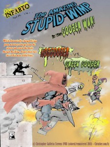
This faux ad for a comic book - the Amazing Stupor-Wimp (AKA Peter Pipsqueak) - was about a teenage weakly boy who was bitten by a rather small baby radioactive garden spider, which transformed him into an indestructible human being with good leaping ability able to walk on walls, and the completely original ability to fire spiderweb that shot out of his wrists, and also he's kind of indestructible.
Spider-Wimp vs. Hobgoober vs. Green Goober!
Problem was, Peter has a very low-IQ, is terrible at problem-solving, is very lazy, and also very physically weak, so basically he is useless as a Super-Hero, other than the fact that his enemies can't kill him, and that pisses them off. Two of his baddest villains are ugly sons of b!tches who look like Goblins and sling booger bombs. This kind of loosely reminds you of something doesn't it? Naww.... really?
At the time I was doing these, Marvel Comics was doing a giant crossover storyline called "Inferno" that went through many of their titles in 1988. Spider-Man, X-Men, and others I'm sure. This was the time I discovered Todd McFarlane with Amazing Spider-Man #312:
Todd McFarlane's amazing artwork for Spider-Man in 1988-90 is what deeply inspired the artwork on my comic from this point forward! Amazing Spider-Man #312 here from Fall 1988 was my introduction to his work, and I became a fan/collector at that moment.
It was Fall 1988. I was a freshman in high school. The Sunbow/Marvel Transformers and G.I. Joe cartoons that I had rabidly enjoyed from 1984-87 had sadly just finished their runs, and I was seeking more entertainment for artistic inspiration, and I just started picking up some comic books - G.I. Joe, Transformers, Spider-Man, Batman, and X-Men for starters. I was in the now defunct Penn-Can mall in Syracuse, NY (which then became a college after that and/or a car dealership now). I went into a bookstore and checked out the comic rack.
I saw this issue.
It blew me away.
I couldn't put it down from the moment I saw it and I had to buy it.
It was then and there where I was introduced to the highly stylized artwork of Todd McFarlane, and became an instant fan. This was pre-Spawn and pre-action figures, which most people know him for. I know him for this. His work was an odd mix of American comic books, a little anime-like stylistic/cartoony distortion, and copious amounts of highly detailed ink-work that no other comic book at the time that I ever saw even came close to. It reminded me of one of my favorite Transformers episodes, Call of the Primitives, which also had a highly stylized look and is fondly remembered as the best-looking Transformers episode of all time. I had never seen anything like it and was addicted from the cover onward.
But not just McFarlane! This was also the time that Marc Silvestri was doing Uncanny X-Men and Jim Lee was doing The Punisher: War Journal. Also, Art Adams had some books (but mostly covers and posters) here and there, and I would get addicted to his style as well. Talk about some fantastic artists with fresh looks at the top of their game... these guys reeeaaally inspired me big time. As this comic rolls on, one can see their art influencing me day by day. McFarlane and his unique stylistic flare and hypnotic detailed inkwork. Lee with his fundamentally accurate, yet still gorgeous anatomy. There were more, of course, but those two really struck a nerve with me.
This page was a satirical shout-out to Marvel's Inferno saga comic event that was running at the time, and also was a starting point on one of the biggest influences in not just my style (which you'll be able to see it from this point on) - Todd McFarlane.
The above page was colored and touched up on 5/19/2013 for the website. The original art from Fall 1988 lies below:
I changed it from Spider-Wimp to Stupid-Wimp and then finally to Stupor-Wimp because it sounded funnier and more in line with the character. Should I also rename "Amazing" to "Indestructible"? That would also line-up, but Amazing looks more flashbacky to the Spidey title back then (and my favorite Spidey font... not a big fan of the webby one or the movie one). Let me know.
***Crickets...***
Okay then. Next page.
5 thoughts on “The Amazing Stupor-Wimp vs. Hobgoober vs. Green Goober | Classic Crusher Comics #3 (1988)”


 I changed it from Spider-Wimp to Stupid-Wimp and then finally to Stupor-Wimp because it sounded funnier and more in line with the character. Should I also rename "Amazing" to "Indestructible"? That would also line-up, but Amazing looks more flashbacky to the Spidey title back then (and my favorite Spidey font... not a big fan of the webby one or the movie one). Let me know.
***Crickets...***
Okay then. Next page.
I changed it from Spider-Wimp to Stupid-Wimp and then finally to Stupor-Wimp because it sounded funnier and more in line with the character. Should I also rename "Amazing" to "Indestructible"? That would also line-up, but Amazing looks more flashbacky to the Spidey title back then (and my favorite Spidey font... not a big fan of the webby one or the movie one). Let me know.
***Crickets...***
Okay then. Next page.
5 thoughts on “The Amazing Stupor-Wimp vs. Hobgoober vs. Green Goober | Classic Crusher Comics #3 (1988)”
Christopher Galletta Stevens
“Use Microsoft. Apple is overpriced/overrated trash, and is better as a preppy, low-IQ fashion statement than a useful, well-priced item.”
-RaYzor