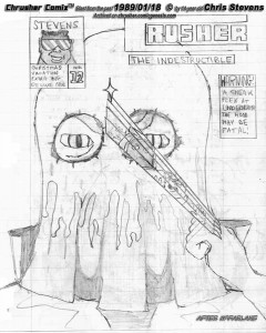

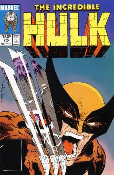
 Ah, a tip of the hat to Todd McFarlane's famous Hulk/Wolverine cover. I was a big McFarlane fan back then, and still love his kinetic, proportionally exaggerated, highly embellished style, especially from around that era. Many people blast his art as sometimes having poor anatomy and layout, but it is eye-catching. One could make the most perfectly drawn comic book page in the world, but if it doesn't catch the reader's eye, then nobody will care. In my mind, finding the best of both worlds would be key, and what I aim for in my more mature books. His influence is still visible in my newer comics today, and longtime comic collectors will see the homage to this classic cover. Except, when I was 14, I couldn't draw THAT good. I could pull it off now. Back then, I paid a pretty penny for that issue at my local comic shop, and it still doesn't go cheap.
ORIGINAL, UNCOLORED VERSION:
Ah, a tip of the hat to Todd McFarlane's famous Hulk/Wolverine cover. I was a big McFarlane fan back then, and still love his kinetic, proportionally exaggerated, highly embellished style, especially from around that era. Many people blast his art as sometimes having poor anatomy and layout, but it is eye-catching. One could make the most perfectly drawn comic book page in the world, but if it doesn't catch the reader's eye, then nobody will care. In my mind, finding the best of both worlds would be key, and what I aim for in my more mature books. His influence is still visible in my newer comics today, and longtime comic collectors will see the homage to this classic cover. Except, when I was 14, I couldn't draw THAT good. I could pull it off now. Back then, I paid a pretty penny for that issue at my local comic shop, and it still doesn't go cheap.
ORIGINAL, UNCOLORED VERSION:
 Yep. Good classic, vintage stuff.